The Great Math Tour: Exploring the World of Circle Graphs
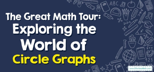
1. The Destination: Circle Graphs
Circle graphs, much like the delicious pies they are named after, are divided into several ‘slices’ or ‘sectors’. Each slice represents a different category of data, and the size of the slice corresponds to its proportion of the whole.
The Absolute Best Book to Ace the GRE Math Test
Original price was: $27.99.$17.99Current price is: $17.99.
Categories: The graph represents students’ preferences for apples, bananas, and oranges.
And that concludes our math tour to Circle Graphs! I hope you enjoyed the journey and found a new appreciation for these pie-shaped data representations. Remember, the world of math is vast and full of wonder, so keep exploring and discovering. Until our next math adventure!

Original price was: $109.99.$54.99Current price is: $54.99.
Original price was: $109.99.$54.99Current price is: $54.99.

Related to This Article
More math articles
- How to Multiply Radical Expressions? (+FREE Worksheet!)
- 7th Grade Common Core Math Worksheets: FREE & Printable
- Top 10 6th Grade Common Core Math Practice Questions
- How to Use the Law of Cosines to Find Angle Measure?
- 10 Most Common GED Math Questions [Updated for 2026]
- Geometry Puzzle – Challenge 69
- Complete Guide to Inverse Trigonometric Ratios
- Cracking the Code: How Math is Empowering Students to Solve Real-World Problems in the Digital Age
- Empower Your Homeschooling Efforts with ‘Pre-Algebra for Beginners’
- Top 10 Tips to Overcome PSAT Math Anxiety


What people say about "The Great Math Tour: Exploring the World of Circle Graphs - Effortless Math: We Help Students Learn to LOVE Mathematics"?
No one replied yet.