Line Plot
A line plot is a graph that shows data with the help of symbols above a number line that shows the frequency of each value. In this guide, you will learn how to create a line plot and interpret it.

A line plot is also known as a dot plot. In the line plot, data is represented on a number line using symbols for frequency.
A step-by-step guide to the line plot
A line plot is a graphical representation of data in a line of numbers using a dot, a cross, or any other symbol. Each symbol indicates a specific quantity, which is the scale of the chart.
The categories of the data are displayed on the number line followed by drawing marks or symbols to indicate the variables over each category.
Line plot graph
A line plot graph is a way to display the data on a number line using symbols. It is different from a line graph because we are not using a Cartesian plane or an \(x\) and \(y\)-axis to display data. A line plot graph is drawn simply on a number line.
How to make a line plot?
A line plot is an excellent way to display data graphically. Follow the steps below to create a line plot:
- Step 1: Identify the data category.
- Step 2: Count the frequency of each category and display it using any symbol you choose. However, using only one type of symbol along with the chart is important. For example, we do not use the dot and the cross sign together in one line plot to represent the same thing.
- Step 3: Mention the label and scale. The label is what we write under the categories on the number line. A scale is a unit or number that each symbol represents.
However, when we use \(1\) unit as a scale, in many places you may find that the scale is not used. Therefore, when the scale is not mentioned, we consider it as \(1\) unit.
Reading a line plot
To read a line plot, we must first identify the scale or units that each symbol represents. If nothing is mentioned, we consider it \(1\) unit. Then we count the symbols used in each category in the number line. Multiply the number of symbols by the scale to get the frequency of each category.
Line plot with fractions
A line plot with fractions is made like other numbers or variables. In this, we show the fractional values on the number line and their frequencies or the number of times they are occurring in the data set above each fraction.
Exercises for Line Plot
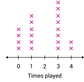
1. John asks all his friends how many times a week they play video games. Each \(x\) in the line plot represents a friend. How many of John’s friends said they play video games more than twice a week?
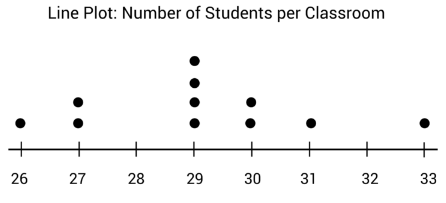
2. Class sizes in middle school range from twenty-five to thirty-five students. The line plot below shows the number of sixth-graders in each class. What is the mode, or most common, number of students per class?

- \(\color{blue}{Ten\:friends}\)
- \(\color{blue}{29\:students}\)

Related to This Article
More math articles
- How to Subtract Mixed Numbers? (+FREE Worksheet!)
- Integrals: Complete Explanation of the Applications and Use
- How to Deciphering the Puzzle of Time: A Step-by-Step Guide to Solving Age Problems in Mathematics
- The Ultimate 6th Grade OAA Math Course (+FREE Worksheets)
- Top 10 4th Grade MCAS Math Practice Questions
- How to Overcome GED Math Anxiety?
- 10 Most Common 7th Grade PARCC Math Questions
- Decimals Unfolded: How to Switch Between Standard and Expanded Forms
- The Ultimate TNReady Algebra 1 Course (+FREE Worksheets)
- Top 10 3rd Grade NYSE Math Practice Questions


What people say about "Line Plot - Effortless Math: We Help Students Learn to LOVE Mathematics"?
No one replied yet.