How to Graph Box Plot?
Box plot visually shows the distribution of numerical and skewness data by showing data quartiles and averages. In this step-by-step guide, you learn more about box plots and graphing them.

A box diagram is a special type of diagram that shows the quartiles in a box and the line that extends from the lowest to the highest value.
Related Topics
A step-by-step guide to the box plot
A method for summarizing a set of data that is measured using an interval scale is called a box and whisker plot. These are mostly used for data analysis. We use these types of charts or graphs to know:
- Distribution shape
- A central value of it
- Variability of it
A box plot is a graph that shows data from a five-number summary containing one of the measures of central tendency. It does not show the distribution in particular as much as a stem and leaf plot or histogram does. But it is primarily used to indicate whether a distribution is skewed or not and if there are potential unusual observations (also called outliers) present in the data set.
Parts of box plots
- Minimum: The minimum value in the given dataset.
- First Quartile \((Q1)\): The first quarter is the middle of the lower half of the data set.
- Median: The median is the middle value of the dataset that divides the given dataset into two equal parts. The median is considered the second quartile.
- Third Quartile \((Q3)\): The third quartile is the middle of the upper half of the data.
- Maximum: The maximum value in the given dataset.
Apart from these five terms, the other terms used in the box diagram are:
- Interquartile Range \((IQR)\): The difference between the third quartile and first quartile is known as the interquartile range. \(IQR = Q3-Q1\)
- Outlier: The data that falls on the far left or right side of the sorted data is tested to be the outliers. In general, the outliers fall more than the specified distance from the first and third quartile. Outliers are greater than \(Q3+(1.5\times IQR)\) or less than \(Q1-(1.5\times IQR)\).
Box plot distribution
The box diagram distribution explains how the data is grouped, how the data is skewed, and also the symmetry of the data.
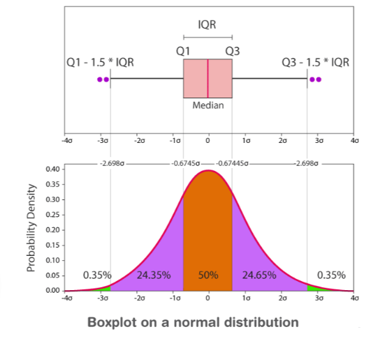
- Positively Skewed: If the distance from the middle to the maximum is greater than the distance from the middle to the minimum, the box diagram has a positive skewed.
- Negatively Skewed: If the distance from the middle to the minimum is greater than the distance from the middle to the maximum, the box diagram will be negatively skewed.
- Symmetric: If the median is equidistant from the maximum and minimum values, the box plot is symmetric.
Box plot chart
In a box and whisker plot:
- The end of the box is the top and bottom quadrants so that the box crosses the interquartile range.
- A vertical line inside the box marks the median.
- The two lines outside the box are the whiskers drawn to the highest and lowest observations.
Box Plot – Example 1:
Find the maximum, minimum, median, first quartile, and third quartile for the given data set: \(24, 46, 12, 10, 15, 14, 8\).
Solution:
Given: \(24, 46, 12, 10, 15, 14, 8\).
Arrange the given dataset in ascending order.
\(8, 10, 12, 14, 15, 24, 46\)
Therefore,
Minimum \(= 8\)
Maximum \(= 46\)
Median \(= 14\)
First quartile \(= 10 \left(Middle\:value\:of\:\:8,\:10,\:12\:is\:10\right)\:\)
Third quartile \(= 24 \left(Middle\:value\:of\:15,\:24,\:46\:is\:24\right)\).
Exercises for Box Plot
Draw a box and whisker plot for each data set.
- \(\color{blue}{22, 24, 25, 26, 21, 22, 28, 29, 23}\)
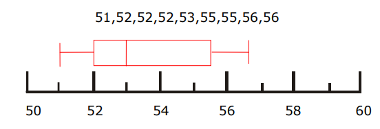
- \(\color{blue}{51, 53, 52, 56, 52, 55, 55, 56, 52}\)


Related to This Article
More math articles
- Top 10 7th Grade MEAP Math Practice Questions
- 3rd Grade MEAP Math FREE Sample Practice Questions
- 6th Grade ACT Aspire Math Worksheets: FREE & Printable
- How to Solve a Quadratic Equation by Factoring?
- FREE ACT Math Practice Test
- Top 10 AFOQT Math Prep Books (Our 2023 Favorite Picks)
- What is the Relationship between Dilations and Angles in Geometry
- 10 Most Common ParaPro Math Questions
- Top 10 HiSET Math Practice Questions
- TSI Math Practice Test Questions




What people say about "How to Graph Box Plot? - Effortless Math: We Help Students Learn to LOVE Mathematics"?
No one replied yet.