How to Interpret Histogram? (+FREE Worksheet!)
Imagine sorting your class by height into a few buckets, then stacking the buckets so you can see how tall each pile is. That picture is a histogram: a bar chart where each bar shows how many values fall inside a numeric range, called a bin. The bars touch (no gaps), because the data is continuous. Read a histogram and you can spot the shape, the center, the spread, and any sneaky outliers your data is hiding.
Key takeaways:
[include_netrun_products_block from-products="product/grade-8-math-for-students-the-ultimate-step-by-step-guide-to-preparing-for-the-grade-8-math-test/" product-list-class="bundle-products float-left" product-item-class="float-left" product-item-image-container-class="p-0 float-left" product-item-image-container-size="col-2" product-item-image-container-custom-style="" product-item-container-size="" product-item-add-to-cart-class="btn-accent btn-purchase-ajax" product-item-button-custom-url="{{url}}/?ajax-add-to-cart={{id}}" product-item-button-custom-url-if-not-salable="{{productUrl}} product-item-container-class="" product-item-element-order="image,title,purchase,price" product-item-title-size="" product-item-title-wrapper-size="col-10" product-item-title-tag="h3" product-item-title-class="mt-0" product-item-title-wrapper-class="float-left pr-0" product-item-price-size="" product-item-purchase-size="" product-item-purchase-wrapper-size="" product-item-price-wrapper-class="pr-0 float-left" product-item-price-wrapper-size="col-10" product-item-read-more-text="" product-item-add-to-cart-text="" product-item-add-to-cart-custom-attribute="title='Purchase this book with single click'" product-item-thumbnail-size="290-380" show-details="false" show-excerpt="false" paginate="false" lazy-load="true"]- Histograms show frequency of values in numerical bins (intervals).
- Bars touch - unlike a bar graph, where categorical bars have gaps.
- The x-axis shows the bins; the y-axis shows the frequency or count.
- Look at shape (symmetric, skewed, bimodal), center, and spread.
- A histogram of test scores in bins of width 10 shows how many students fell in each range.
Histograms represent the distribution of numerical data. Learn how to interpret and solve Math problems containing histograms. For education statistics and research

Data Displays, Stem-and-Leaf Plots, and Circle Graphs: what to notice and how to work it
What to notice first
Common student mistake
Key formulas and cues
A reliable path
- Identify the questionDecide whether you need center, spread, shape, or association.
- Use the right displayChoose a histogram, box plot, scatter plot, or summary statistic.
- Write the meaningExplain what the statistic says about the data set.
Worked examples
Read a histogram interval
- The interval is 10 through 19.
- Height tells how many data values fall there.
- There are 7 values in that interval.
Circle graph percent
- Circle graphs use the full circle as 100%.
- 1/4 is 25%.
- The angle is 1/4 of 360 degrees.
Try one before moving on
Data Displays, Stem-and-Leaf Plots, and Circle Graphs: pop-up practice
Watch this practice video for additional examples and reinforcement:
Related Topics
- How to Interpret Pie Graphs
- How to Solve Probability Problems
- How to Solve Permutations and Combinations
- How to Find Mean, Median, Mode, and Range of the Given Data
What’s a Histogram?
Histograms are the graphical interpretation of information where information is grouped into constant amount ranges and each of those ranges relates to a vertical bar.
- A horizontal axis shows the number range.
- A vertical axis (frequency) signifies the quantity of information available for each range.
The number ranges are dependent upon the information being utilized. So, here’s more info regarding histograms.
The Absolute Best Books to Ace Pre-Algebra to Algebra II
The method of creating histograms utilizing the provided info is shown here:
- Step one: Pick an appropriate scale to designate weights on a horizontal axis.
- Step two: Pick an appropriate scale to designate the frequencies on a vertical axis.
- Step three: After that, make the bars consistent with each of these given weights by utilizing their occurrences.
Hints and Techniques on Histograms
Here are several vital hints and techniques you should remember while envisioning any information via histograms.
- Pick the scale for the vertical axis whilst creating a histogram, make sure to check for the uppermost number that separates all frequencies. If there’s no such number existing, after that check for the utmost number which separates the majority of frequencies.
- Histograms are graphs utilized to summarize constant information.
- A histogram gives the visual interpretation of continuous data.
- Scales of both the horizontal and vertical axes do not have to begin with zero.
- There ought not to be any gaps between the bars of histograms.
- To interpret histograms, check the height of each bar that shows how many fall into each range.
The Best Book to Help You Ace Pre-Algebra
Histograms, Example 1:
Use the following Graph to complete the table.
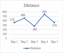
Solution: The graph you see above is a histogram. This chart gives you a brief overview of the distance traveled over different days. The horizontal axis represents the days traveled and the vertical axis represents the distance. The points marked on the graph indicate the distance traveled in each day, according to which you can complete the relevant table. Check the distance during each day from the graph and write it in the table below. For example, the distance for day \(1\) is \(378\) and for day \(2\) is \(480\).
| Day | Distance (km) |
| 1 | 227|
| 2 | 480 |
| 3 | 239240|
| 4 | 245|
| 5 | 251
Histograms, Example 2:
Use the following Graph to complete the table.
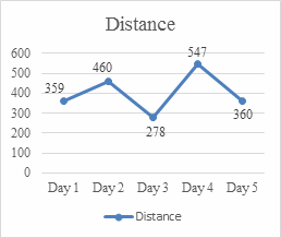
Solution: Check the distance during each day from the graph and write it in the table below.
| Day | Distance (km) |
| 1 | 280281|
| 2 | 460 |
| 3 | 278 |
| 4 | 547 |
| 5 | 304305
Exercises for Solving Histograms
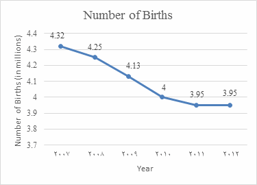
The following table shows the number of births in the US from \(2007\) to \(2012\) (in millions).
Answer these questions based on the data of the graph.
1- During what period the percent of change was zero?
2- During what period there was the biggest decrease in the number of births?
3- What was the percent of change from \(2008\) to \(2012\)?
Download Histograms Worksheet
1- \(\color{blue}{2011- 2012}\)
2- \(\color{blue}{2009 - 2010}\)
3- \(\color{blue}{7\% }\)
The Greatest Books for Students to Ace the Algebra
Recommended EffortlessMath Books
For a complete grade-level workbook that covers data and statistics alongside the rest of pre-algebra, Pre-Algebra for Beginners walks you through statistics topics with clear examples and try-it-yourself problems. For more practice with data and probability at middle-school level, Mastering Grade 6 Math includes plenty of worked exercises.
Pre-Algebra for Beginners 2026 The Ultimate Step by Step Guide to Preparing for the Pre-Algebra Test
Frequently Asked Questions
What is a histogram?
A histogram is a chart that shows how often values fall into specific numerical intervals, called bins. The horizontal axis shows the bins (like 60-69, 70-79, 80-89, 90-99 for test scores), and the vertical axis shows the count or frequency of values in each bin. Bars touch each other because the underlying data is continuous - there's no "gap" between consecutive bins.
How is a histogram different from a bar graph?
A bar graph compares separate categories (favorite color, sport, brand), so its bars have gaps between them. A histogram shows the distribution of a single numerical variable in bins, so its bars touch. If your x-axis values are categories, use a bar graph. If they're numerical intervals, use a histogram.
How do you read a histogram?
Pick a bar, then check two things: which bin (interval) it represents on the x-axis, and how high it goes on the y-axis. Example: a bar over the bin 70-79 reaches a height of 12 - that means 12 data values fall between 70 and 79. To find the total count, add up the heights of all bars.
What's a bin (or class), and how do I choose one?
A bin is a numerical interval that groups values together. For test scores 0-100, common bin widths are 5, 10, or 20 points. A good rule of thumb is to aim for somewhere between 5 and 15 bins total. Too few bins hides patterns; too many makes the chart look noisy. A data set with 50 values often looks good with 6 to 8 bins.
What's frequency vs. Relative frequency?
Frequency is the raw count of values in a bin. Relative frequency is that count divided by the total number of data points - it expresses each bin as a fraction or percent of the whole. Example: if 12 of 50 students scored in 70-79, the frequency is 12 and the relative frequency is \(\frac{12}{50} = 0.24\), or 24%.
What does the shape of a histogram tell me?
The shape describes the overall distribution. Symmetric (roughly bell-shaped) means values cluster around the center. Right-skewed (long tail on the right) is common for incomes and reaction times. Left-skewed (long tail on the left) is common for exam scores when most students do well. Bimodal (two peaks) might mean two underlying groups, like male and female heights mixed together.
How do I find the median from a histogram?
A histogram doesn't show individual values, but you can estimate the median by finding the bin where the cumulative count passes half the total. If 50 students took a test and the bins from low to high have counts 4, 8, 14, 18, 6 (total 50), the median lies in the third bin (the cumulative count reaches 26 by the end of that bin, which crosses 25 - half of 50).
What's an outlier on a histogram?
An outlier on a histogram appears as a short, isolated bar far from the main body of the data, with empty bins between it and the rest. Example: most scores cluster between 60 and 95, but a single value lands in the 20-29 bin with no values between. That isolated bar suggests an outlier worth investigating.
Why do some histograms have unequal bin widths?
Sometimes uneven widths make sense - for example, age groups 0-17, 18-64, \(\color{blue}{65+ \text{ on }}\) a population chart. In that case, the bar height should represent density (count per unit width), not raw count, so areas stay comparable. For most intro-level work, stick with equal bin widths and read the bars as counts.
Where do histograms show up on tests?
Middle-school state tests from grade 6 up, the SAT, ACT, GED, GRE, ASVAB, AP Statistics, and college placement tests. Typical questions: read off a frequency, compute relative frequency, find a total, identify the shape of the distribution, or estimate the median or quartiles.
Related EffortlessMath Lessons
If a topic on this page feels rusty, these short lessons go deeper:

Related to This Article
More math articles
- Migration, Citizenship, and Belonging
- Draft Needs a Boost? A Guide to the Best AI Essay Rewriters for Students
- Supporting Details
- 7th Grade Scantron Math Worksheets: FREE & Printable
- The Best Grade 4 ELA Practice Tests for Montana Students
- What Happens If You Don’t Pass the STAAR Test?
- Cell Structure and Function
- How Students Can Create Memorable Fictional Characters for Narrative Writing
- Top 10 Free Websites for CHSPE Math Preparation
- The Ultimate 7th Grade LEAP Math Course (+FREE Worksheets)
What people say about "How to Interpret a Histogram"?
No one replied yet.