Distributions in Line Plot
Here, you will learn how to create a line plot to represent the distribution of a set of data.
This involves plotting individual data points on a number line and analyzing the distribution by looking at how the points are spread out across the intervals.

The steps involved in creating a line plot include determining the data set, range, and a number of data points, as well as choosing intervals, creating a number line, plotting the data, counting the dots, connecting the dots, and analyzing the distribution.
By following these steps, you can effectively communicate the distribution of a small data set in a clear and concise way.
A step-by-step guide to distributions in a line plot
There are 2 simple steps to describe the distribution:
Step 1: Compute the range of the data set.
To compute the data set’s range, follow these steps:
Determine the greatest data value and the least of the data values.
Subtract the smallest data value from the biggest data value.
Range\(=\)greatest value\(-\) the smallest value
Step 2: Use the range for describing the distribution.
Here’s a step-by-step guide to distributions in a line plot:
- Determine the data set: Start with a set of data that you want to represent on a line plot.
- Determine the range of the data: Find the minimum and maximum values of the data set.
- Determine the number of data points: Count the number of data points in the data set.
- Determine the intervals: Divide the range of the data into intervals. You can choose any interval size that makes sense for your data, but it should be consistent across the entire line plot.
- Create a number line: Draw a number line with the minimum and maximum values of the data set at either end. Label the number line with the intervals you have chosen.
- Plot the data: For each data point, plot a dot on the number line at the appropriate interval.
- Count the dots: Count the number of dots that fall within each interval.
- Connect the dots: Draw a line connecting the dots in each interval.
- Analyze the distribution: Look at the line plot to determine the distribution of the data. If the dots are evenly distributed across the intervals, the distribution is considered to be uniform. If the dots are clustered around certain intervals, the distribution is considered to be skewed.
- Label the line plot: Label the line plot with a title, axis labels, and any other relevant information, such as the interval size.
It’s important to note that line plots are best used for smaller data sets with a limited range of values. For larger data sets, a histogram or box plot may be a more appropriate way to represent the data.
Distributions in Line Plot – Example 1
What does this line plot show?
Solution:
The data is spread out from 1 to 6.
The column for 4 has the most ×s. So, the data has a peak at 4.
There are no ×s in the columns for 2 to 3. So, there is a gap from 2 to 3.
There is an × in the column for 1, and it is far away from the other ×s. So, there is an outlier at 1 piece.
The data has a cluster from 4 to 6. There is a group of ×s in columns 4 and 6. Every column has at least one ×, and the columns are next to each other.

Distributions in Line Plot – Example 2
What does this line plot show?
Solution:
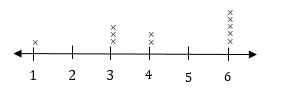
The data is spread out from 1 to 6.
The data has a cluster from 3 to 4. The data has a cluster from 3 to 4. There is a group of ×s in columns 3 and 4. Every column has at least one ×, and they are next to each other.
The column for 6 has the most ×s. So, the data has a peak at 6.

Related to This Article
More math articles
- A Complete Explanation of the Continuity over an Interval
- FREE 6th Grade OST Math Practice Test
- Full-Length ALEKS Math Practice Test
- FREE AFOQT Math Practice Test
- 8th Grade IAR Math FREE Sample Practice Questions
- Intelligent Math Puzzle – Challenge 93
- ISEE Upper-Level Math Worksheets: FREE & Printable
- 8th Grade PSSA Math Worksheets: FREE & Printable
- 6th Grade MAP Math FREE Sample Practice Questions
- How to Determine Indeterminate Form and Vague Limits


What people say about "Distributions in Line Plot - Effortless Math: We Help Students Learn to LOVE Mathematics"?
No one replied yet.