Deciphering the Dots: How to Recognizing and Understanding Graph Patterns
TL;DR: Charts tell stories, and patterns are the plot. When you look at a graph, you are scanning for the shape of the data — trends rising or falling, clumps of points crowding together, lonely outliers, flat plateaus, sudden gaps, or rhythmic cycles. Spotting these patterns is the very first move in interpreting any chart or scatter plot. Train your eye to catch them and you go from staring at dots to actually understanding what the data is trying to say.
Key takeaways:
- Trends are general directions: rising, falling, or flat (no trend).
- Clusters are groups of points packed together – often showing categories.
- Outliers sit far from the rest of the data and may indicate errors or special cases.
- Plateaus are flat sections where a variable stops changing.
- Cycles repeat at regular intervals (temperatures across a year, sales by season).
Step-by-step Guide to Recognizing and Understanding Graph Patterns:
4. Scatter Plots with No Clear Pattern:
If the points on a scatter plot seem randomly distributed with no discernible trend, it indicates that there might be no correlation between the variables.
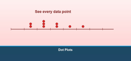
5. Clusters:
Groups of data points clustered together can indicate specific categories or groups within the data.
6. Gaps or Outliers:
A point or points that lie far away from the general trend are called outliers. They can be due to anomalies, errors, or genuinely exceptional cases.
7. Plateaus:
A flat section on a graph indicates that a variable has stabilized and is not currently changing.
Example 1:
A graph showing the growth of a bacterial culture over time might start flat (lag phase), then curve upwards sharply (exponential growth phase), and finally plateau (stationary phase).
The Absolute Best Book for 5th Grade Students

Example 2:
A graph plotting daily temperatures over a year would show an oscillating pattern, with temperatures rising in the summer months and falling in the winter.
Practice Questions:
1. If a graph shows the amount of money saved over time and it forms a straight line going up, what does this indicate?
2. A company plots its sales over a year, and the graph shows a U-shaped curve. What might this suggest about their sales?
A Perfect Book for Grade 5 Math Word Problems!

Answers:
1. The person is saving money at a constant rate.
2. The company might have had low sales at the beginning and end of the year but saw a significant increase in the middle of the year.
The Best Math Books for Elementary Students
Recommended EffortlessMath Books
For a complete walk through data analysis and statistics at middle-school level, the Mastering Grade 5 Math includes plenty of data-interpretation practice with bar graphs, line graphs, and scatter plots. For more advanced patterns and statistics, the Pre-Algebra for Beginners extends the same ideas to two-variable data and correlation.
Frequently Asked Questions
What are graph patterns?
Graph patterns are recognizable shapes or behaviors that appear in data displays. Common patterns include linear trends (steady rise or fall), curves (exponential growth, decay), clusters (groups of points), outliers (lone points far from the rest), plateaus (flat sections), and cycles (repeating shapes). Spotting these patterns is the foundation of data interpretation.
What’s a trend in a graph?
A trend is the overall direction of the data. An upward (positive) trend means values are generally increasing; a downward (negative) trend means decreasing; no trend means values bounce around with no clear direction. Trends ignore individual outliers and small wiggles to describe the big-picture shape.
What’s the difference between a cluster and an outlier?
A cluster is a tight group of data points – usually shows a category or common condition. An outlier is a single point (or small group) sitting far from the rest of the data. Outliers can mean a measurement error, a special case, or a real but unusual event – always worth a second look.
How do I tell positive correlation from negative correlation in a scatter plot?
Positive correlation: as one variable increases, the other also increases – the dots trend up to the right. Negative correlation: as one variable increases, the other decreases – dots trend down to the right. No correlation: dots scatter randomly with no clear up or down pattern.
What’s a plateau on a graph?
A plateau is a flat section where a variable stops changing. Common in growth curves – bacteria growing in a closed container start slow, grow fast, then plateau when they run out of food. On a line graph, a plateau looks like a horizontal stretch.
What does a cyclic pattern look like?
Cyclic patterns repeat at regular intervals. Daily temperatures cycle every 24 hours; yearly weather cycles every 12 months; retail sales often cycle weekly (busier on weekends). On a line graph, cycles look like smooth waves or repeating up-down patterns at predictable intervals.
How do you spot an outlier?
An outlier sits clearly apart from the main cluster of data. There’s no fixed rule (though statisticians sometimes use 1.5 times the interquartile range), but the eye test catches most outliers: “that point doesn’t belong with the others.” Always check whether an outlier is a real value or a typo before deciding what to do with it.
What’s a gap in data?
A gap is a region where you’d expect data points but there are none. On a histogram, a gap shows up as an empty bar between filled bars. Gaps can mean the data has natural divisions (test scores under 50 and over 60 with nothing in between might mean a grading cutoff).
Why does the scale of a graph matter when reading patterns?
The scale shapes how dramatic a pattern looks. A graph with a y-axis from 0 to 1000 will hide small changes; the same data on a y-axis from 50 to 60 will magnify those changes into what looks like a huge trend. Always check the scale before drawing conclusions.
Where do graph patterns show up on math tests?
Grade 4-8 state tests, the SAT, ACT, GED, GRE, and almost every standardized test include data-interpretation questions. Common formats: identify the trend, find the outlier, predict the next value, compare two data sets, or explain what the pattern means in context.
Related EffortlessMath Lessons
If a topic on this page feels rusty, these short lessons go deeper:

Related to This Article
More math articles
- How to Divide Polynomials Using Long Division?
- How to Complete a Function Table from an Equation
- How to graph Scatter Plots? (+FREE Worksheet!)
- How to Solve Word Problems of Budgeting a Weekly Allowance
- Free Grade 8 English Worksheets for Hawaii Students
- Free Grade 3 English Worksheets for Washington State Students
- How to Find the Surface Area of Pyramid?
- The Long Game: How to Actually Remember Math After the Exam is Over
- Grade 2 Math Practice for Iowa Second Graders
- Exponential Growth and Decay Worksheet with Answers

What people say about "Deciphering the Dots: How to Recognizing and Understanding Graph Patterns - Effortless Math: We Help Students Learn to LOVE Mathematics"?
No one replied yet.