Bar Graph
In this article, we are going to provide you with complete information about bar graphs.

What’s a Bar Graph?
Bar graphs are graphs showing complete data via rectangular bars. The height of each bar is proportional to the represented values.
The graph bars may be portrayed horizontally or vertically. Bar graphs are additionally called bar charts and are a graphic depiction of categorized information. It’s an example of the ways to handle data.
Bar graphs are an exceptional tool to show info that’s independent of each other and doesn’t require being in any particular order whilst being depicted. These bars provide a graphic display to compare amounts in various categories.
Bar graphs have \(2\) lines, as well as the horizontal and vertical axis, in addition, they’re known as an \(x\) and \(y\)-axis as well as the labels, title, and a scale range.
Related Topics
Bar Graph Properties
A few properties which make bar graphs unique as well as different from additional kinds of graphs are shown here:
- Every rectangular bar must have an equal width as well as must have an equal space in between them.
- Rectangular bars are able to be created either vertically or horizontally.
- The rectangular bar’s height is equivalent to the information they depict.
- Rectangular bars have to have a common base.
Bar Graph Uses
Bar graphs are mainly utilized in maths as well as in statistics. A few of the reasons bar graphs are used are:
- Comparing the differences between variables is simple and accessible.
- It’s the simplest diagram to make and doesn’t need a lot of effort.
- It’s the top most utilized way to represent data. Thus, it’s utilized by several industries.
- It’s utilized for comparing data sets, which are independent of each another.
- It aids in studying patterns over a long period of time.
Ways to Draw a Bar Graph?
Let’s use an example to see how you draw a bar graph. Mary went to the store to buy several kinds of fruits in various quantities of each one- five apples, three mangoes, as well as two watermelons, three strawberries, and six oranges. She wishes to show the info by creating a bar graph so she can visually recognize which kind of fruits she purchases the most.
Let’s use these steps to create a bar graph showing the fruit bought the most.
- Step one: Take a piece of graph paper and make its title say “Most Bought Fruit”.
- Step two: Draw a horizontal axis (the \(x\)-axis) and a vertical axis (the \(y\)-axis) on a plane.
- Step three: Then label its horizontal axis “Kinds of Fruits” (this is an independent classification) and call the vertical axis “Amount of Fruits” (this is a dependent classification).
- Step four: Label the fruits’ names like apples, watermelons, mangoes, oranges, and strawberries, then draw an equivalent gap or leave the same space in between each of the fruit on the horizontal axis.
- Step five: Give the graph scale that shows how the numbers are being used in the information. It’s a structure of marks placed at fixed intervals that aid in measuring things. For instance, it’s possible to write the graph scale-like \(1\) unit = \(1\) fruit.
- Step six: then begin creating rectangular bars having the same size gaps for each of the fruits, then give height to each of their numbers.
- Step seven: Your bar graph is complete, take a look at the rectangular bar heights for each of the fruits and you will see which is purchased the most.
When creating bar graphs it’s extremely crucial to cite \(4\) things – put labels on the axes, scale, title, and scale, as well as be sure to name the axes.
Bar Graph – Example:
Graph the given information as a bar graph.
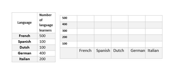
Solution:
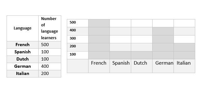
Here we are given the horizontal and vertical axis. The horizontal axis indicates the type of language and the vertical axis indicates the number of learners. The number of learners in each of our languages determines the height of the bar chart. For example, in this example, the French language learners have the largest number and you should give the height of \(500\) to it.
Exercises for Bar Graph
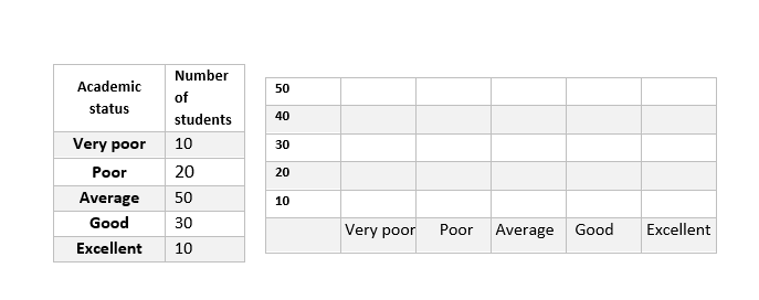
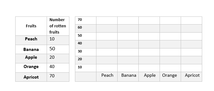
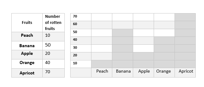
Graph the given information as a bar graph.
1)
2)

1)
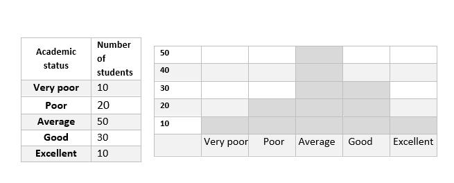
2)
Related to This Article
More math articles
- FREE 5th Grade MEAP Math Practice Test
- Best Laptops for Students: Lenovo vs. HP vs. Dell
- How to Calculate Segment Lengths in Circles Using the Power Theorem
- Top 10 5th Grade OST Math Practice Questions
- FREE ACT Math Practice Test
- A Comprehensive Collection of Free CBEST Math Practice Tests
- Top 10 8th Grade MEAP Math Practice Questions
- Top 10 Free Websites for GED Math Preparation
- The Most Complete Guide to Numerical Methods in Differential Equations
- Top 10 ACT Math Practice Questions


What people say about "Bar Graph - Effortless Math: We Help Students Learn to LOVE Mathematics"?
No one replied yet.